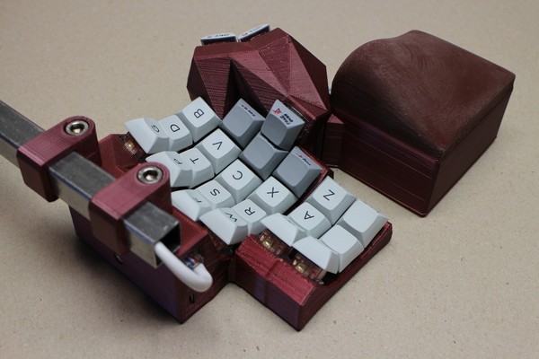
DMOTE #2, corner view

The second working copy, a master print of software release v0.2.0.
A view of the left-hand side navigation cluster, showing the new rear housing with its new screw mount for the MCU.
The wrist pads on this unit are much bigger than DMOTE #1. Not knowing whether the design was good, I made them from some old yellow silicone, and with the increased volume I had to add a lot of ink to match the deep red plastic. Specifically, for each half of the keyboard, I used the following recipe.
- 80 g of each silicone component (total 160 g). Troll Factory brand, Shore A 35. (This is too much. I could have used 70 g, maybe 60, reducing the amount of ink proportionately.)
- 10 ml red acrylic ink.
- 2 ml black acrylic ink.
The results were not good. The chemically polar ink made it difficult to mix the components. The large volume of ink also seemed to make the old silicone a lot less viscous than it needed to be. I couldn’t pour it into the moulds. Fearing the working life was shortened, I didn’t do both halves in one batch.
As a result, there are visible gaps (air bubbles) in the surface of the pads. The pads are also not red enough, nor do they match in colour between the two halves. There must have been tiny differences in the amount of black ink. Please use silicone ink if you can get it, and measure precisely if you’re doing separate batches. With more skill I suppose one could cast onto cloth.
Shore A 35 is too hard for a wrist rest anyway. Aesthetics and materials aside, they are the weakest part of the design, too tall for proper ergonomics. I should have done more testing with hollow PLA maquettes.

