Modular dungeon POC 3

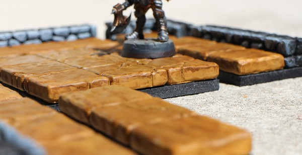
The colour scheme on the floors was very easy to do: primed a light brown and then washed with brown ink. I rather like the way it resembles a glazed, baked clay, though of course such a material would be too soft for a good floor.
The simplicity of the painting process, and the strong contrast to the low walls, was one of the reasons I liked it, but it was too bright and saturated a colour, hence too cheerful for a dungeon. It would also have been difficult to contrast against wood.

